view
case
CASE STUDY

Web platform for market data analysis and seamless collaboration

A case study on designing user-centric web platform for market data analysis and seamless collaboration.
SERVICES
Ideation
Product design
UX/UI design (web & mobile)
Logo Design
Branding
DELIVERABLES
(UX) User research report, Persona, Empathy maps, Sitemap, Static Wireframes, Lo-fi and Hi-fi prototypes
(UI) Pixel perfect UI (web & mobile), Design specifications
Logo
Branding Guidelines
INDUSTRY
Finance
Online trading
Brief project overview
(Reading time: ~3 min)
OVERVIEW

Project overview

A large private investment company needed a secure, customizable platform for real-time financial market monitoring. Their analysts, traders, and investors relied on multiple disconnected tools to analyze market data, compare metrics, and collaborate around investment decisions.

Existing platforms offered parts of the required functionality, but they were either expensive, limited in customization, or did not fully match the team’s workflow and security needs. The goal was to design a centralized platform that could bring key market data, analysis, and collaboration into one workspace.

Key business problems:

Inefficient and fragmented workflow
Traders and analysts relied on multiple disconnected platforms and spreadsheets to organize market data from different sources. This slowed down the workflow, made data harder to manage, and increased security and access risks.
Risk of inconsistent or low-quality data
When market data came from multiple platforms, teams often faced mismatched symbols, different timestamps, duplicate records, and conflicting sources of truth. This created extra reconciliation work and increased the risk of analysis errors.
Limited governance and control
Difficult to control access and maintain an audit trail when data and discussions live across multiple platforms.
To help analysts and traders work more efficiently, the company needed to design and develop a secure platform that would let teams monitor financial markets, organize data from different sources, and make faster investment decisions in one centralized workspace.

Challenge statement:

"How might we design a user-centric platform that simplifies the complexity of market data, fosters seamless communication, and empowers analysts, traders, and investors to make confident decisions through an intuitive and accessible experience?"

Design process (briefly):

As a Generalist UX Designer, I led the UX, UI, and branding direction for the FTN Monitor platform. I worked closely with stakeholders, users, product managers, and developers to define the product vision, structure complex financial workflows, and design a scalable web and mobile experience.
Strategy and research
To understand the product, business logic, users, and their day-to-day workflow, I started with stakeholder briefings and discovery sessions with the product team.
Conducted user interviews with analysts, traders, and investment consultants to understand how they search, filter, group, and compare financial information in their daily work.
I used contextual inquiry to observe traders in their workflow and identify friction in how they used existing tools.
Segmented users by role, created personas, mapped goals and pain points, and translated insights into user stories and product requirements.
Conducted desk research and competitors analysis.
Product structure and validation
Translated research insights and business goals into information architecture, navigation logic, and key user flows for the platform.
Built the user flows step by step, gradually adding complexity so the experience could support dense financial data, multiple tools, and detailed interactions.
Used paper wireframes, lo-fi wireframes, and hi-fi interactive prototypes to test assumptions, gather feedback, and refine the product experience.
UI, branding, and design system
Developed the brand identity for FTN Monitor from scratch, including the logo, visual direction, color system, typography, and brand guidelines.
Designed the responsive web platform interface and later adapted it for native iOS and Android apps.
Developed a reusable UI components library to ensure consistency and accelerate updates.
Handoff and QA
I prepared structured Figma files, design specifications, component states, and interaction notes to make the development process clearer and reduce implementation gaps.
I worked closely with developers during implementation to clarify functionality, maintain design fidelity, and make sure the product matched the approved UX/UI direction.

Results:

I led the end-to-end UX/UI and branding for FTN Monitor, shaping a complex financial monitoring product from early concept into a working MVP. My work helped turn fragmented analyst and trader workflows into a centralized experience where users could search, compare, and act on dense market data faster. The platform is now in real-data MVP testing, with early users already validating the direction and helping shape the next stages of development.
Business value
Newly designed visualization tools reduced the time needed to search, compare, and organize financial data by at least 30% compared to the previous workflow across multiple platforms and spreadsheets.
Early real-data testing and validation helped define the MVP direction and shape the product design roadmap for future development.
The design system and reusable UI components will help keep the platform consistent as it grows, while making future updates and feature development faster and easier.
A scalable product structure I designed that supports future new tools, features, and financial datasets as the product continues to grow.
DESIGN PROCESS

Plan of action

1.

Empathise

Stakeholders briefing
Business requirements
User interviews
Contextual inquiry
Empathy maps
Personas
User stories
User journey maps
2.

Define

Defining user problems
Project strategy definition
Stages of development
3.

Ideate

Competitive audit
Brainstorm solutions to the users problems
Evaluating and selecting solutions that meet user needs and business requirements
4.

Prototype

App structure
Wireframes
Lo-fi and Hi-fi prototypes
Interactive functional prototype
Technical requirements
5.

Branding

Concept development
Logo and icon design
Colors
Typography
Integrations
6.

UI Design

Visual concept
Web responsive mockups
Native iOS app design
Android app design
Design system
Micro-animations
7.

Testing

Usability tests
Mockups finalisation
Specification
Design handoff to developers
The design process begins with stakeholder interviews and desk research to understand product vision, user needs and competition before ideation or prototyping. On this stage was very important to gather as much insights and requirements as possible from stakeholders and potential users (traders, analytics).

After spending hours observing traders and their professional routines, I have gained a thorough understanding of the various instruments they utilize. Through this experience, I have identified which features and mechanics on competitors' platforms are functioning seamlessly and can be utilized as is, as well as those that require significant improvements.


Upon analyzing these insights, I began conceptualizing a solution by focusing on user flows and wireframes, allowing for faster iteration of ideas. This led me into production mode, where I designed the interface with design principles like contrast, hierarchy, and feedback, as well as brand attributes and user interactions. While designing the mobile app, I followed Material Design and Human Interface Guidelines.

During and after Prototype phase,  I gathered feedback from stakeholders and users to identify any gaps in the user experience.
RESEARCH

Understanding customer’s needs

I started with a several interviews with product owner and key stakeholders, who were actually future users (customers) of the future platform. Those interviews helped me to answer main questions and to understand important aspects of the product that need to be built:
Why does company decide to invest time and money into developing own expensive platform instead of continuing to use existing similar tools on the market?
What are the high-level problems with using the current 3rd party monitoring platform?
What are business goals?
Desired functionality and approximate structure of the platform.

User Interviews

After gathering insights from product owner and key stakeholders, and a couple of brainstorm sessions, I faced the need to get users’ perspectives on the sparking opportunities raised as outcomes from my investigation.

To do so, in collaboration with our Product Owner, we came up with 3 days workshop, with interviews and activities.
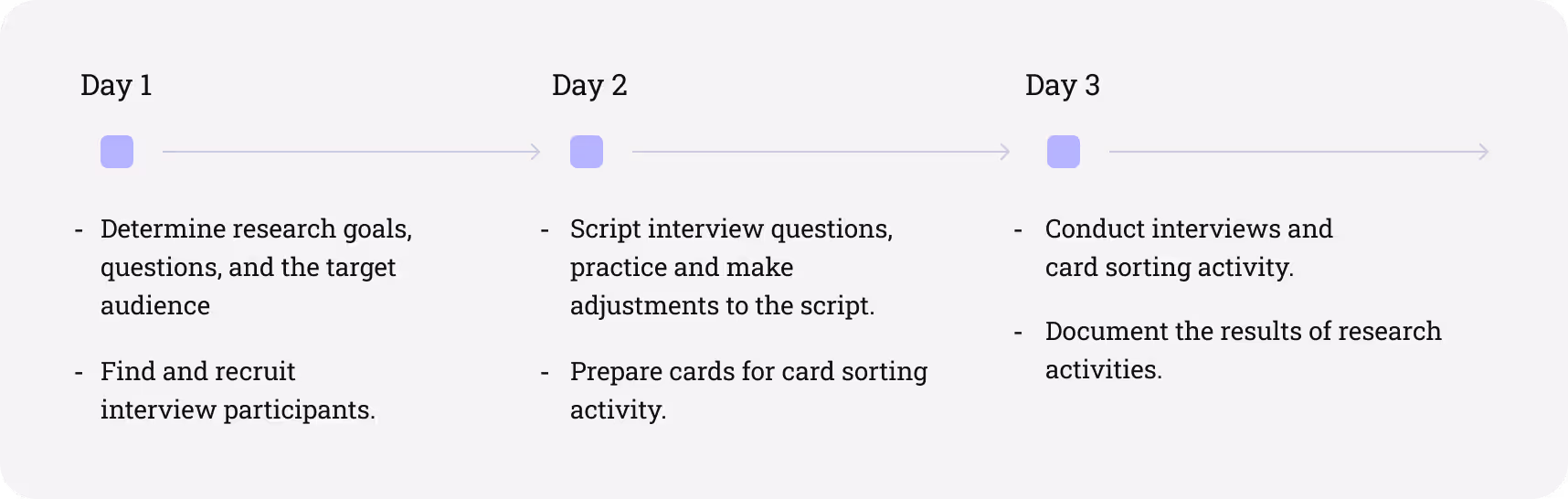
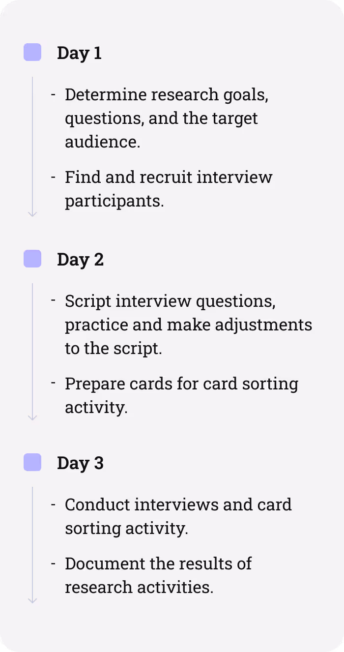
The interview sample took into account men and women aged from 24 to 56, trading analysts and investment consultants, active employees of investment company. Each interview took approximately 30 minutes and included topics to get to the core of what users are trying to do and what their problems are. So I asked:
How do you search specific information (financial reports, news, e.t.c.)?
How users group, filter and access gathered information?
What information and, what functional as a result, is the most/least usable on day-to-day routine?
What annoys them while they using current monitoring patterns?
What would they change in their routine?
As a follow-up activity, a card sorting was performed, users were prompt to group cards with platform features into “must-have”, “better to have”, and “good to have” buckets.
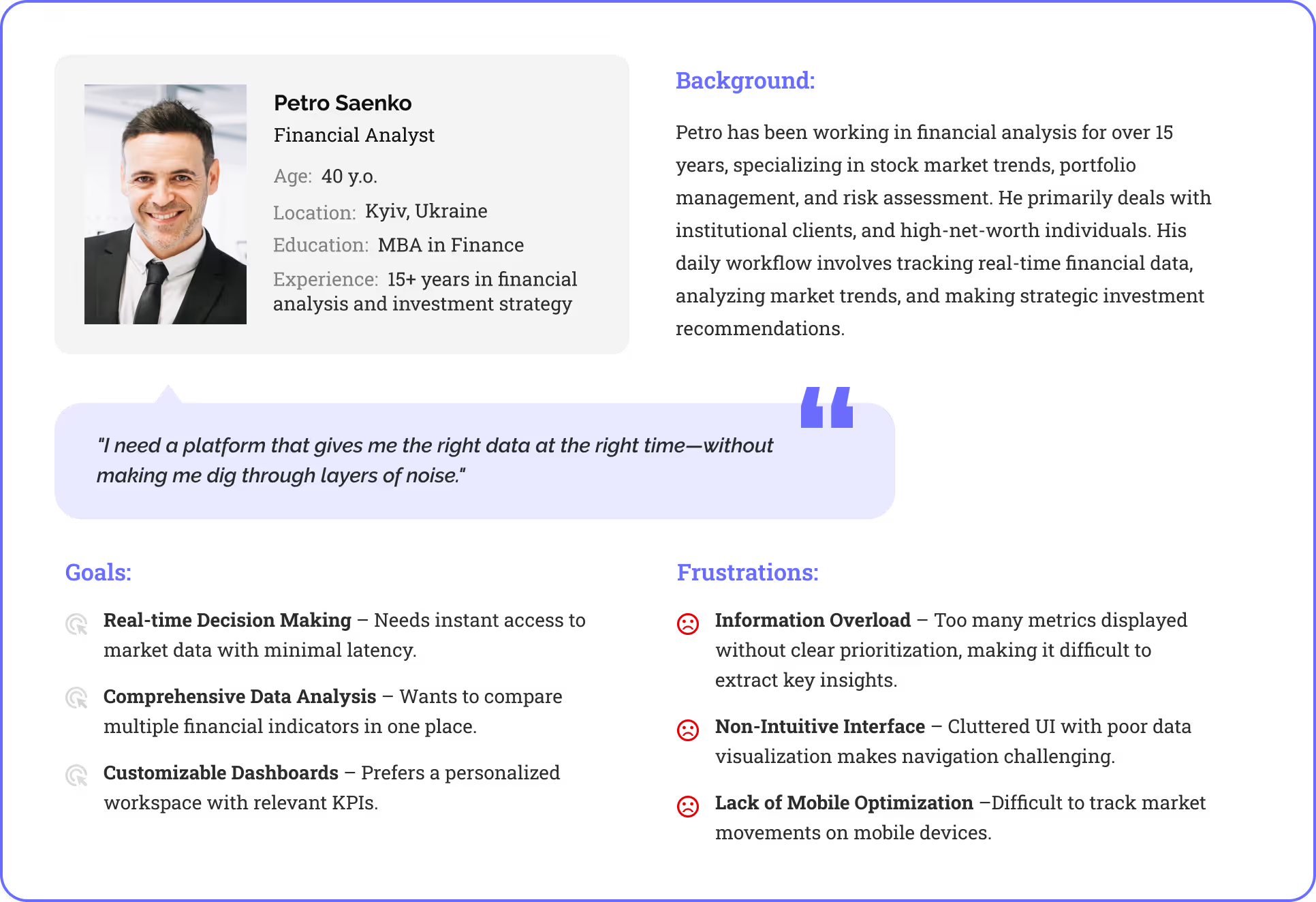
Persona

Personas are fictional users whose goals and characteristics represent the needs of a larger group of users. We segmented all our possible users into 5 groups and I created a persona for each corresponding group. Here is one of them:

Contextual Inquiry

The next important research activity was contextual inquiry. Basically, I spent 2 days observing different traders and their professional routines. This activity provided me with enough observations, so I truly began to empathize with users and their perspectives.

Desk research

In addition, I researched major financial market monitoring platforms (especially the one they were using as a go-to platform in the company). Insights that I gathered from user interviews showed that some features are outstanding and users really like them as they are. The goal was to understand how those features work, so I would be able to use them in developing a platform.
PROTOTYPE

Information Architecture

Before diving into wireframes and interactive prototypes, I started the prototype phase with Information Architecture (IA) to ensure a structured, intuitive, and scalable design for the real-time financial market monitoring platform.

Given the complexity of financial data—spanning multiple asset classes, analytics tools, and real-time market movements—organizing the platform’s structure first was essential. IA helped define clear navigation, user flows, and data hierarchies, ensuring that traders, analysts, and investors could easily access key insights without feeling overwhelmed.

Lo-fi paper wireframes

Once the Information Architecture (IA) of the platform was finalized and confirmed by all stakeholders involved in the development process, I moved on to my favorite part of the Prototype phase within the Design Thinking Framework: creating Paper Wireframes. I typically create paper wireframes for every screen of an app, starting with the main user flows and gradually adding more details. This approach allows me to iterate as many times as necessary to achieve the desired interface without investing excessive time in the project.

Digital wireframes and prototypes

After finalizing the Information Architecture and sketching paper wireframes, I moved on to digital wireframing for both web and mobile versions of the real-time financial market monitoring platform.

With digital wireframes and interactive prototyping, I set the foundation for usability testing, ensuring an intuitive experience for financial analysts and traders across all devices
BRANDING

Branding elements and Identity

I started with a brand design from the scratch. Establishing a new brand style that would become a basis for the main product design.
USER INTERFACE

Extensive platform functionality

Although this is only the first working version of the platform, and only 20% of what was planned has been implemented, FTN Monitor already has a wide range of tools that provides coverage of markets, industries, companies & securities across all asset classes.
Complete customization
Users can completely customize not only the interface of the dashboard but also the way they use it. Using pre-made chart applications, templates, and shortcuts can help users work quickly and efficiently.
Consolidated visual data
Allows to faster validate ideas, spot trends and take action when you can plot and compare multiple instruments in a single chart.
Real-time collaboration
Users can communicate, share and co-edit charts with each other in real time using built-in secured communication platform.
Backtesting
Users can simulate thousands of scenarios with varied benchmarks to define targeted strategies and techniques for optimal profit over time.
Fully customizable charting with 100+ technical and fundamental indicators, 50+ drawing tools, and studies.
Stock Screeners, Gainers & Losers, Bubble Charts, Heat maps, Forex Matrix help to analyse and identify trends to visualise new trading ideas.
USER INTERFACE MOBILE

IOS and Android mobile app

After the feedback from stakeholders and development team series of improvements of the web version was made. It was time for me to proceed with design of a native app for iOS and Android platforms. To make user experience as intuitive as possible I followed principles of Material design and Human Interface Guidelines (HIG).
OUTCOME

Positive feedback and good engagement

Platform is currently in its Alpha phase on it’s early testing cycle using real data. Despite that is only Alpha phase of the platform, and only 25% of the planned features implemented so far, test group of users are already sharing great feedback.
At least
less time needed for the user on searching specific data then through multiple existing sources
More then
of existing clients introduced to the platform are ready to switch to FTN in the future

What went well

User interviews unconverted lots of user behaviour that steered the project in a meaningful direction.
Contextual inquiries allowed to have a look at the business process from a different angle and provided us with enough observations, so we truly began to empathise with users and their perspectives.

What went wrong

We tend to have too many features for the MVP which was a development challenge till we focused on most important features.
Designing high volume content interfaces that are connected and overlapped with each other with multiple layers of data took more time than expected. Tens of iterations on almost every screen of the platform has to be done.

NEXT PROJECT

Picapac