
Brief project overview
Reading time: ~2 min
Project overview
Picapac (owned by Omniva) is an Estonian nationwide network of autonomous community parcel lockers designed for smaller communities. As name says it is a parcel locker, which is intended for communities, apartment buildings, commercial properties and generally to the areas, where big parcel machines have not yet reached.
Jetbeep, a long-time partner and solution provider for Omniva, was commissioned to design and develop web application for customers and couriers of Picapac parcel network.
Why Picapac needed this app?

As an emerging parcel locker network, Picapac required a mobile app that would let both customers and couriers access and use lockers.
With limited resources at the early stage, instead of investing in native apps, needed a lightweight solution with only core functionality that could be launched and validated quickly, then expanded through future MVP iterations.
They needed a scalable tool to manage and monitor the locker network.
Challenge statement:
"How might we design a complete browser-based application that delivers a great experience for customers and couriers using community parcel lockers, while also giving the admin team an easy-to-use management tool?"

Design process (briefly):
As a UX/UI Designer - I was a part of the product development team at Jetbeep and developed this product in close collaboration with Product Owner, PM and Web Developers.
To understand the product, business logic, users, and their problems I had an introduction discovery session with the product team.
Segmented users into personas (by role), clarified their goals and pain points, and designed target user stories that reflect what each group really needs.
Defined users and business pain points and formed hypotheses.
Conducted competitors analysis.
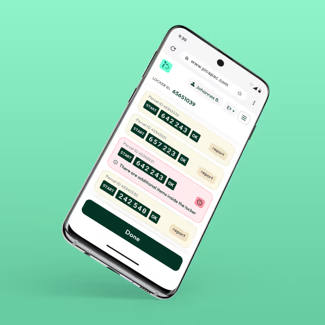
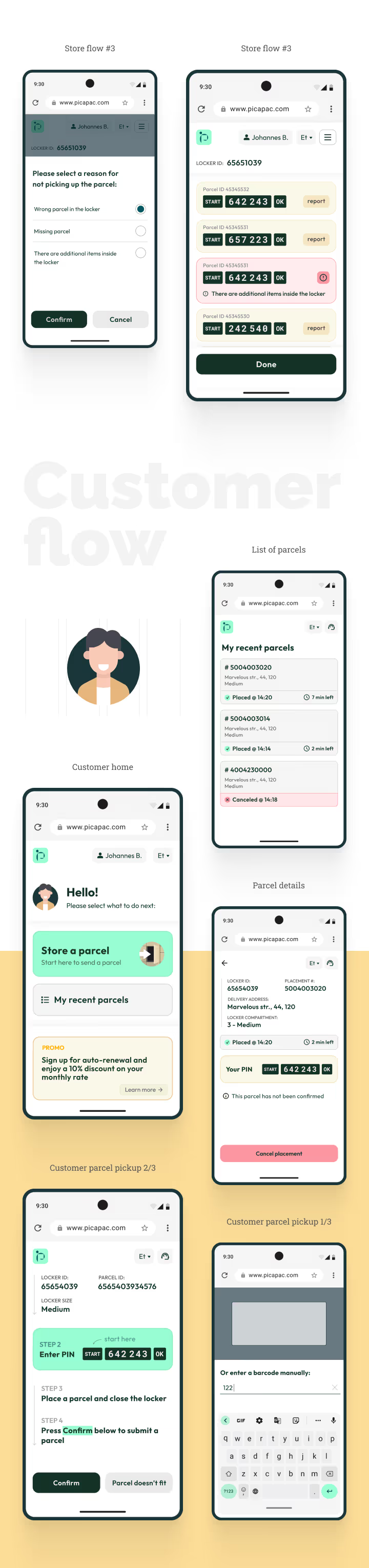
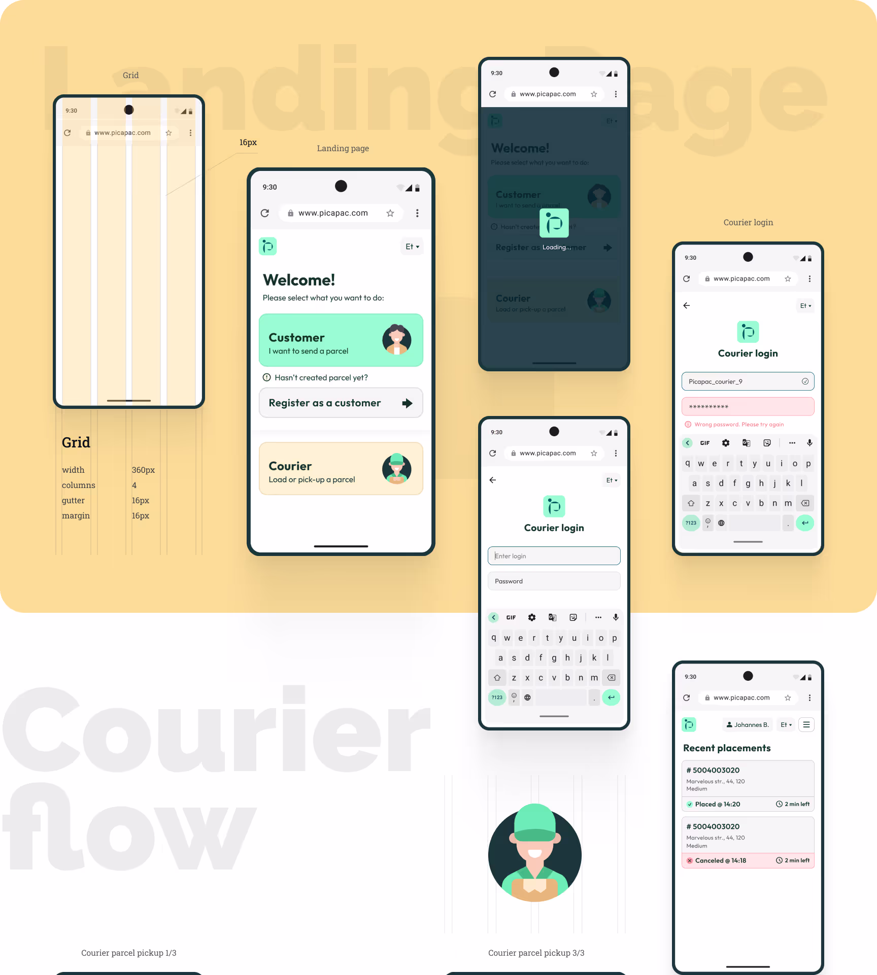
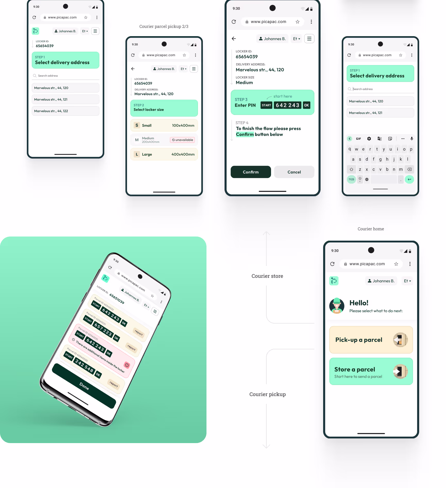
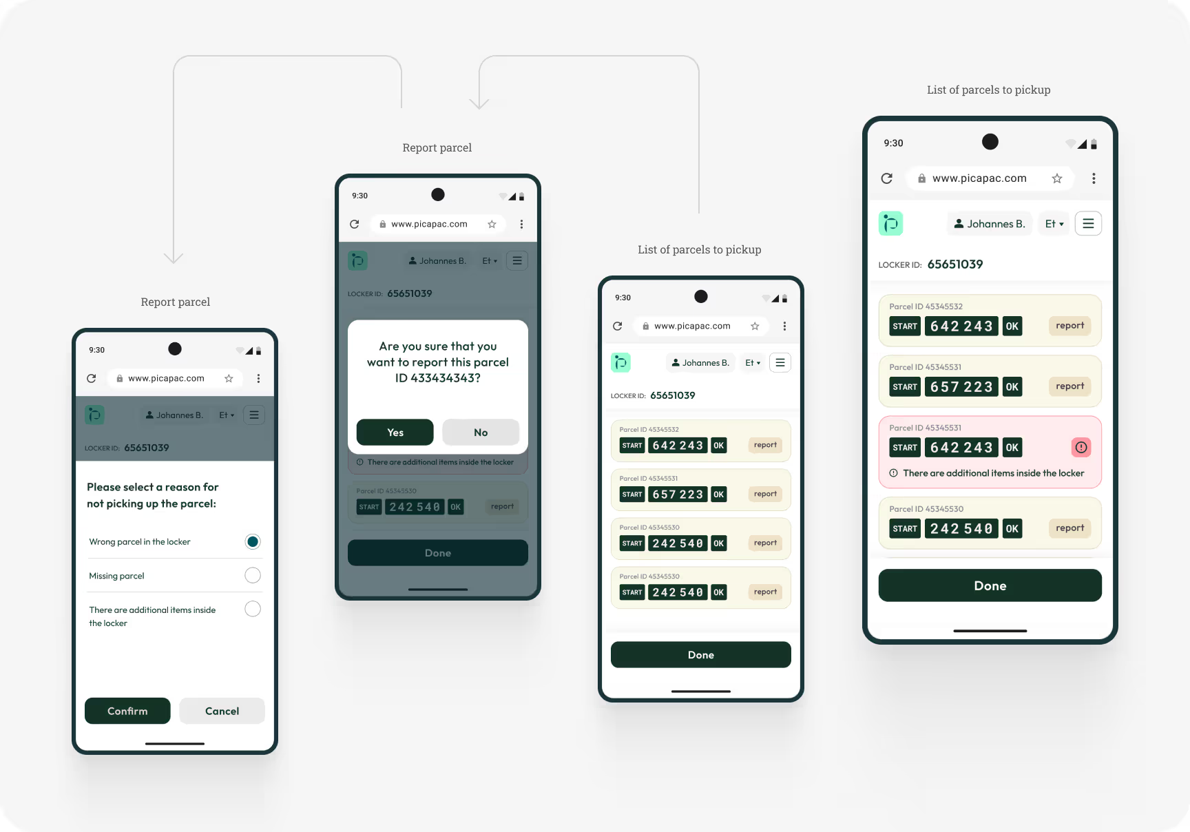
Translated research insights and product goals into product structure: re-designed and tested user flows, provided by product team (customer and courier place and pick-up flows).
Designed information architecture, lo-fi wireframes and hi-fi interactive prototypes to quickly test and refine key flows.
Ran a usability study (after refined hi-fi interactive prototype) and updated flows based on insights.
Designed a clean, consistent responsive mobile-first UI, that actually feels like native mobile app and makes all product flows and scenarios easy to scan and understand.
Developed a reusable UI components library to ensure consistency and accelerate updates.
For design handoff, I prepared the Figma files for development and added detailed comments to key screens and interactions to reduce developer questions, and streamline implementation.

After development, I conducted design QA in close collaboration with engineers through several iterations to ensure the MVP matched the approved designs, met product requirements, and then continued improving the experience and adding new functionality across the next two MVPs.
Results:
In this project, I led the product design of Picapac’s mobile-first web app end-to-end — from discovery, personas, and user-flow design to prototypes, visual direction, hi-fi UI, usability testing, handoff, and QA. This process helped us launch a clean and intuitive experience for both customers and couriers, reduce implementation risk, and validate the product quickly at an early stage. The result was a successfully launched solution that enabled real operational use at scale, while also creating a strong foundation for further improvements and new functionality in later MVPs.
Reduced product and delivery risk through iterative prototyping, usability testing, and design QA, which improved implementation, minimized rework, and created a strong foundation for future MVP improvements and new functionality.
Supported operational scale with a usable tool for both customers and couriers, helping Picapac run a growing locker network (about 400 community lockers) and serve roughly 12,000 unique users per month.
Enabled market launch and early validation by delivering a mobile-first web app that could be shipped faster than a native app, allowing the business to start operating and learning from real usage sooner.
A detailed walkthrough of my design process
Reading time: ~5 min
Plan of action

Define
Users and business problem statements
UI Design
Mobile-first pixel-perfect mockups
Testing
Design handoff to developers
Stakeholders briefing
I started the project by having an introduction discovery session with the product owner. At this stage my goal was to understand the business logic, product, its users, and their problems as thoroughly as possible. Product owner also provided product and project requirements and preliminary user flows.
A mix of fragmented insights about product users and their goals and pain points.
Gained a clear understanding of Picapac’s parcel locker network operations, business goals, and technical constraints.
Preliminary user flows from the product team.
Started the Product / UX Specs Document and added all findings from this stage.
User personas
To get a better understanding of who I’m designing this app for, I grouped the users in 2 groups, and, using the insights I gathered earlier, created a persona for each group. I outlined their goals and frustrations, which helped me focus the design on real needs rather than assumptions. That helped to see which UX issues I needed to address in the design process.
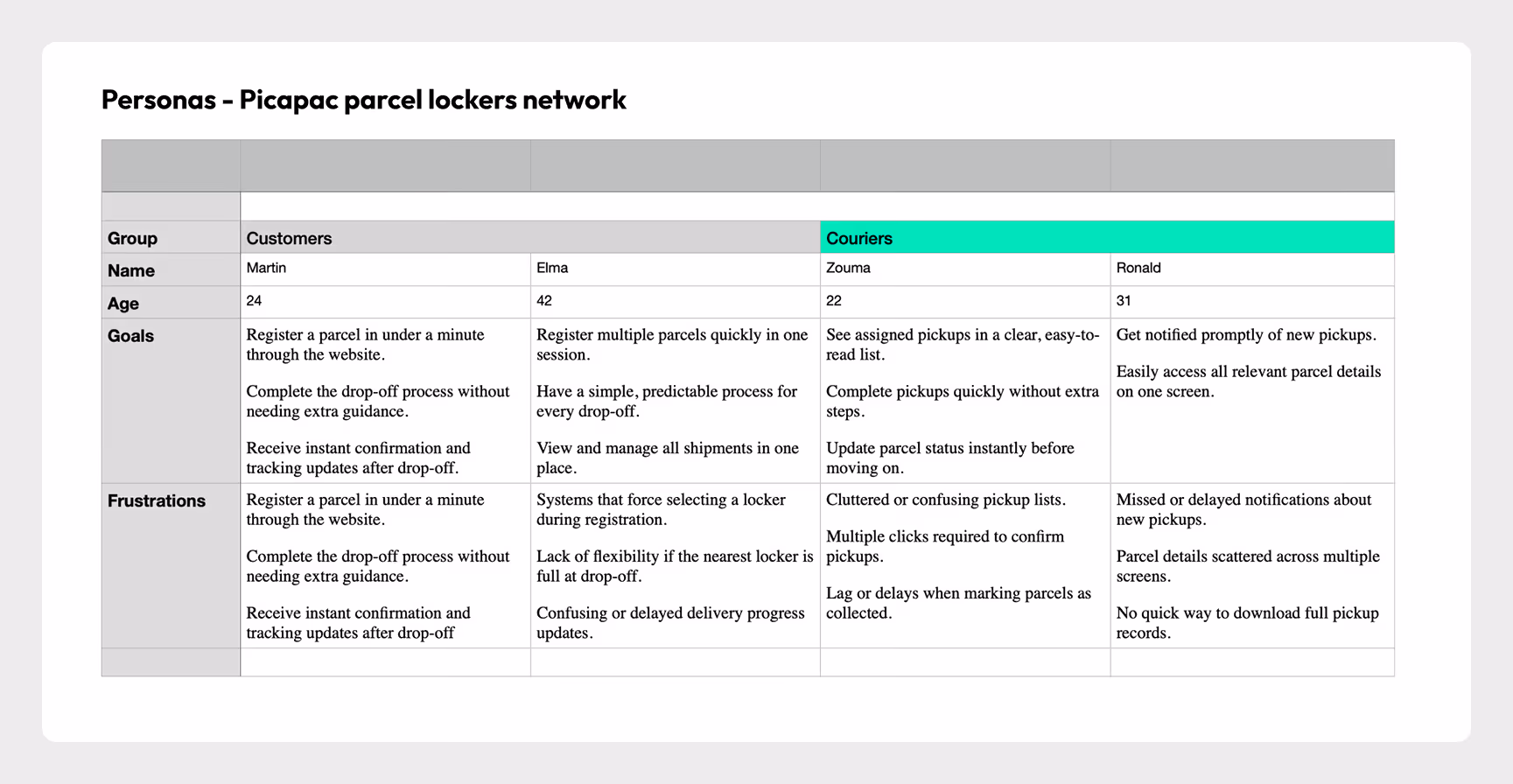
User’s and business needs
During the Empathize stage, I worked closely with the Product Owner to understand the operational model of the locker network, key user roles, and where friction occurs in the current process. By focusing on real operational workflows and defined earlier user roles I was able to define user pain points. After that, I grouped the pain points into themes and validated them with the Product Owner to make sure we were solving the right problems before moving into solutions.
JTBD
To better understand what the product should enable, I looked at what key users are actually trying to accomplish when interacting with the locker network.

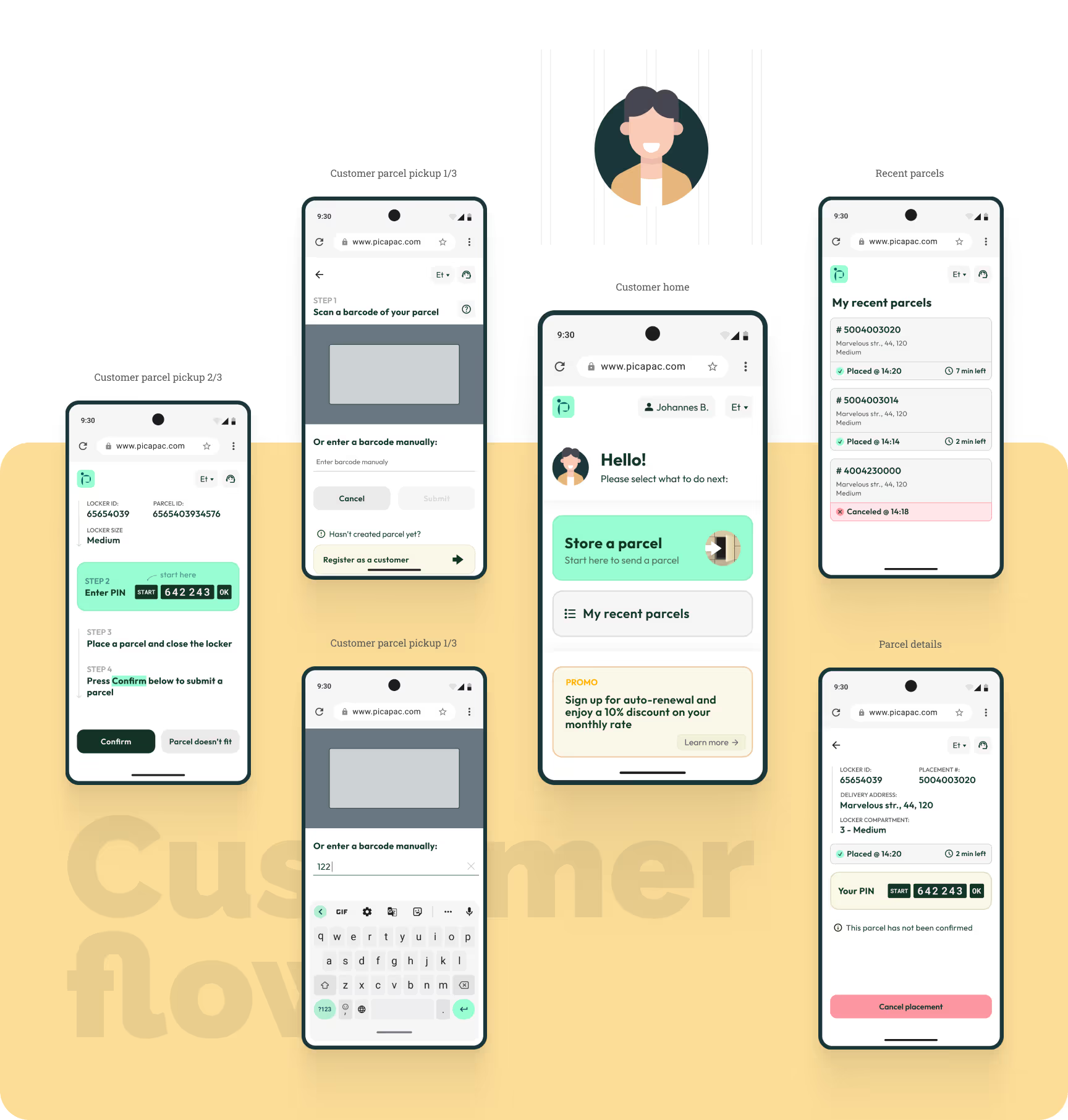
Customer — Sending Parcels
When I need to send a parcel, I want to quickly place it into a nearby locker so it can be collected and delivered without coordinating directly with a courier.

Courier — Delivery Job
When delivering parcels, I want to quickly assign and place packages into available locker cells so I can complete deliveries efficiently and avoid mistakes.
Courier — Parcel Pickup
When collecting outgoing parcels, I want to easily locate and retrieve them from the locker so I can continue my delivery route without delays.
Identifying and prioritizing business needs
Learn the operational context
Connected business and operational constraints to real user pain points
Define the key business needs
Turned that into clear business needs: smooth operations, efficient courier flows, and a simple sending experience for users.
Prioritize based on impact
Prioritized the ones that directly impact business performance and user satisfaction
Maximize locker utilization. Ensure lockers are easy to access and use so the network can handle more parcels and operate efficiently.
Reliable and simple parcel handling. Provide a clear and secure process for sending, delivering, and collecting parcels to build trust and reduce operational friction.
Efficient management tool, that simplifies the management and monitoring of locker usage, maintenance, and availability.
User flow update
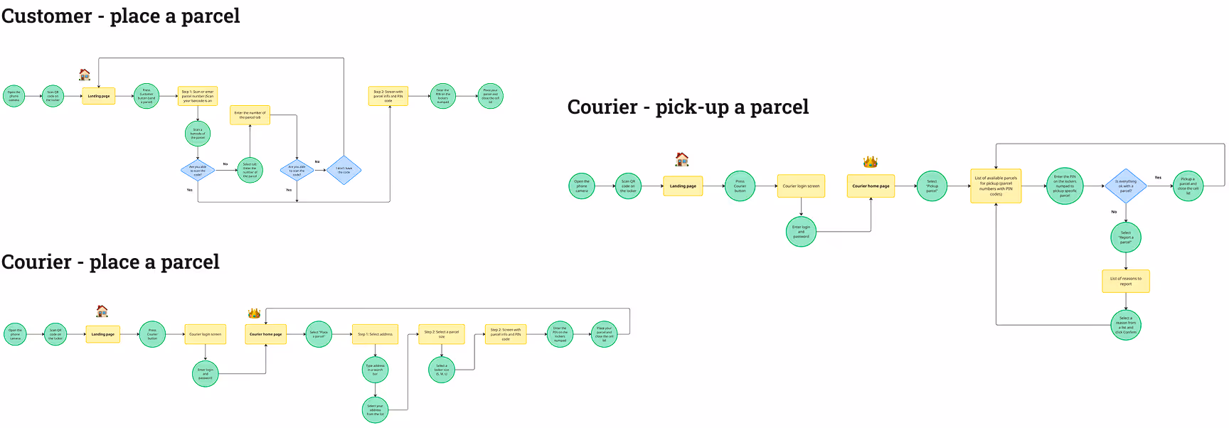
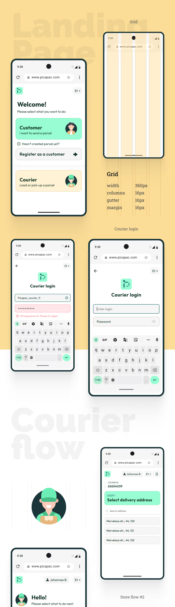
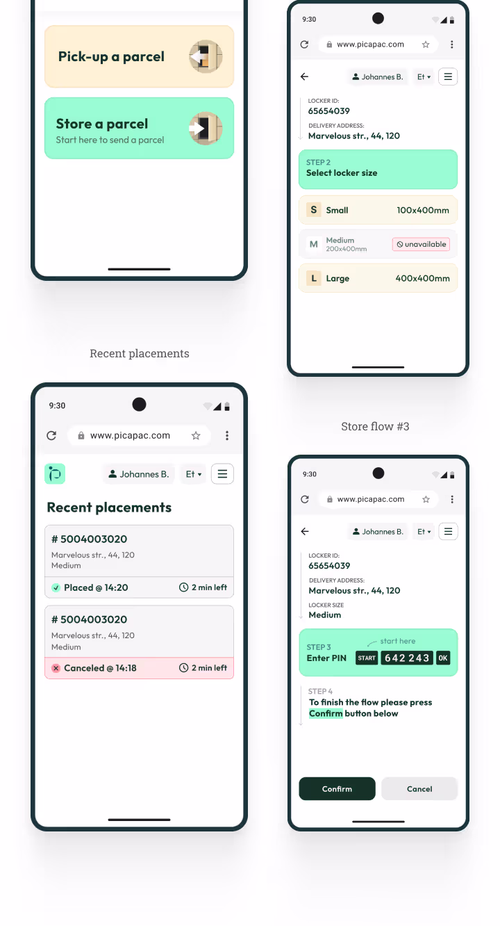
Although the product team provided a preliminary user flow, I thoroughly analyzed it and redesigned it in close collaboration with the product owner.
App map and functional prototype (lo-fi)
After app structure and all major user flows were approved, It was time to create functional prototype. First I designed the app map. Then, using the app map, I started adding functionality to each screen — why this screen exists, what role it plays in the user flow, what actions it supports, where it leads next.
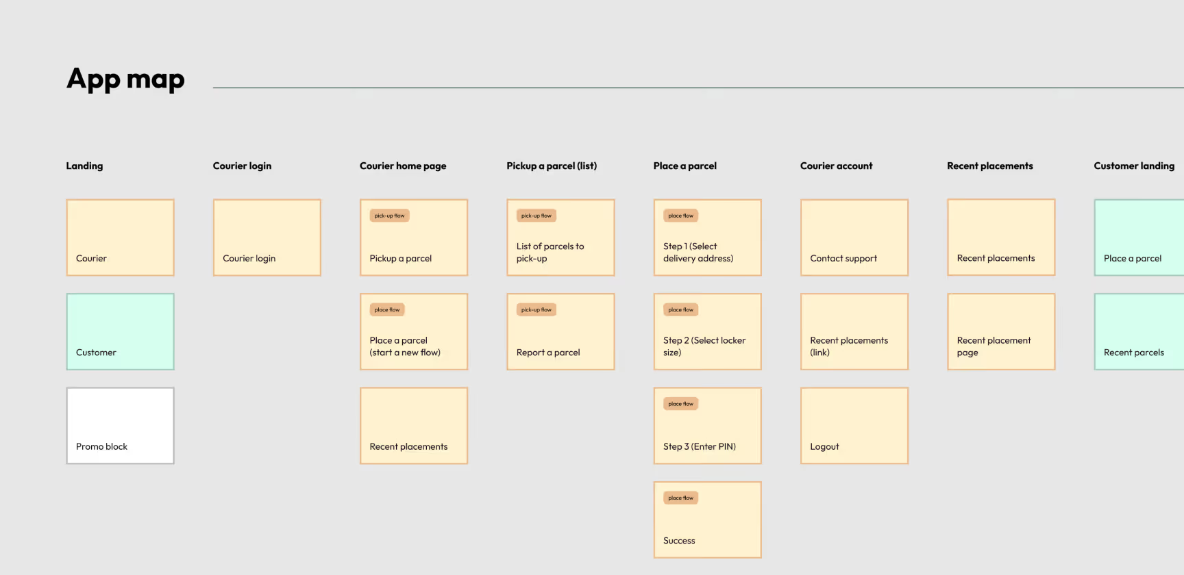
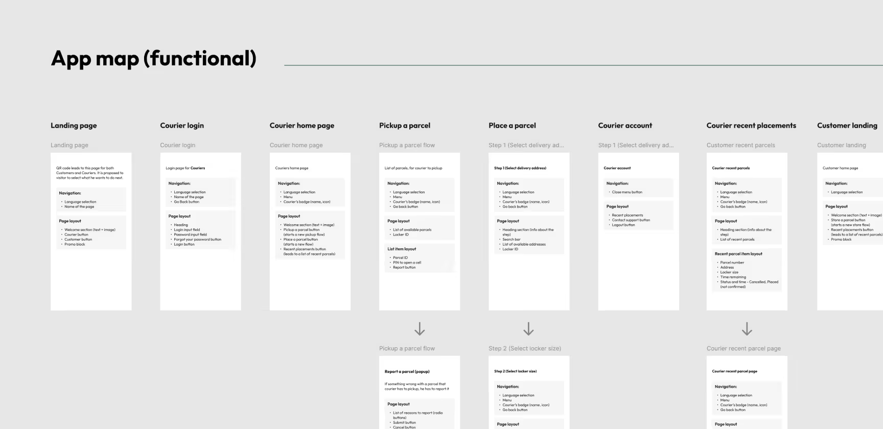
Functional prototype
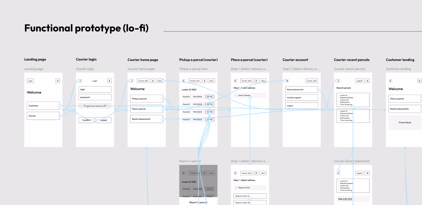
Lo-fi wireframes and prototype
I used lo-fi wireframes to quickly map the layout and key interactions without getting distracted by visual details. I then grouped the wireframes into a clickable lo-fi prototype so the product team could walk through real scenarios end-to-end, and their feedback helped us spot gaps early, clarify edge cases, and iterate on the flows before moving to hi-fi UI.
Visual concept
So the nex thing I did was a Visual concept. I created a few moodboards and had a briefing with the product owner to understand which visual style they prefer. The client wanted the interface to be clean and built around their brand colors.
After a few iterations, I refined the core concept and presented it to the product team for review.
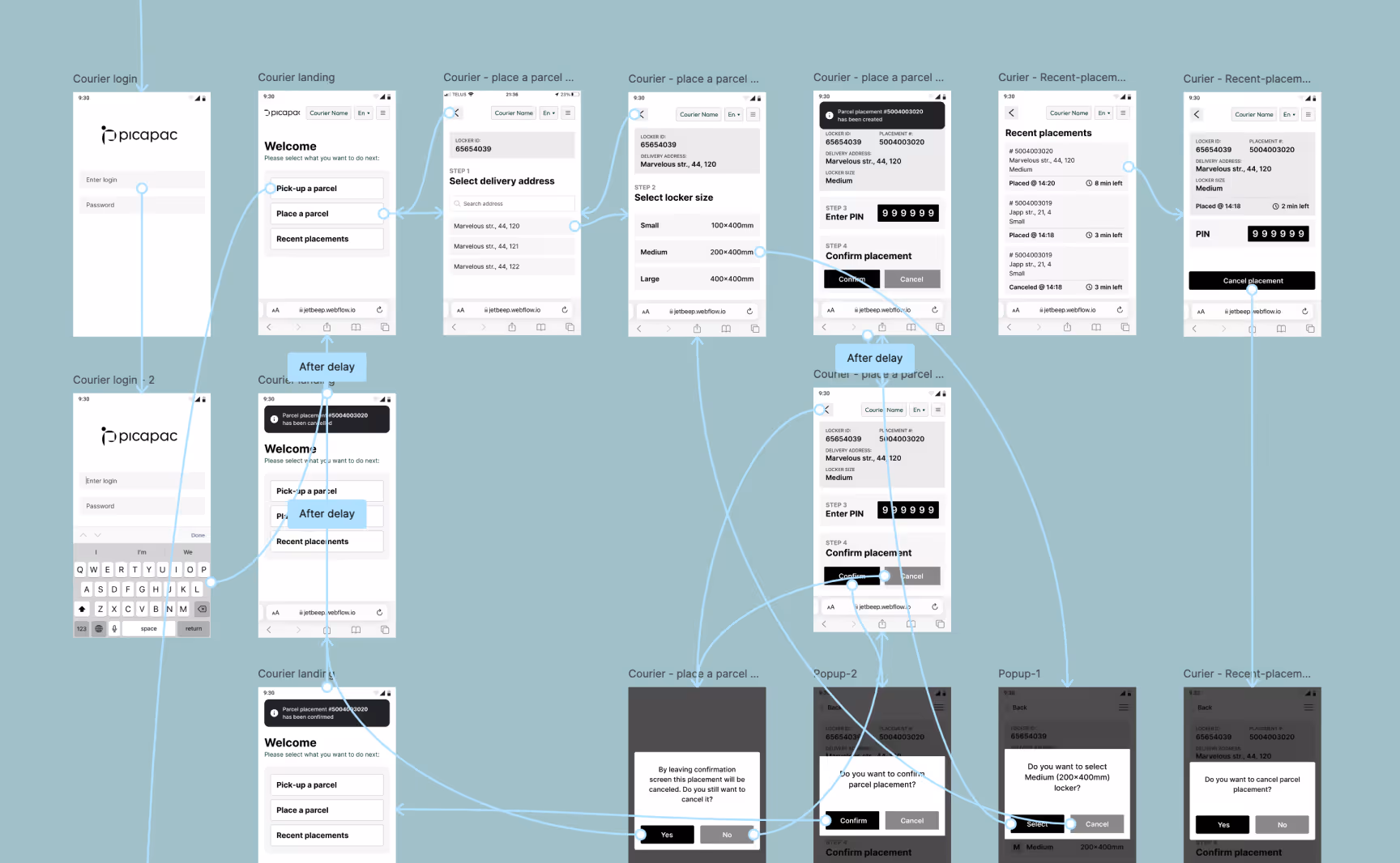
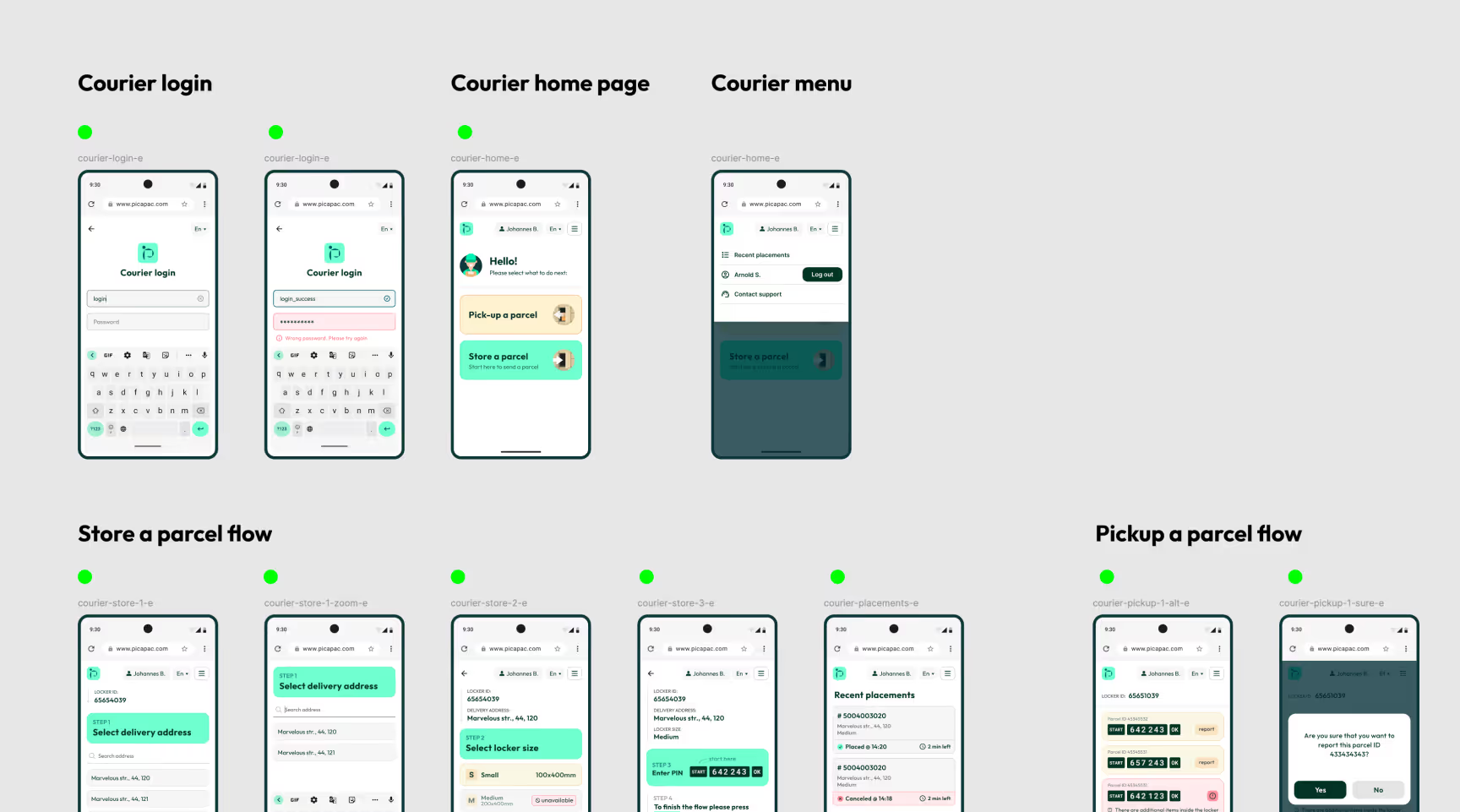
Hi-fi wireframes and prototype
So the nex thing I did was a Visual concept. I created a few moodboards and had a briefing with the product owner to understand which visual style they prefer. The client wanted the interface to be clean and built around their brand colors.
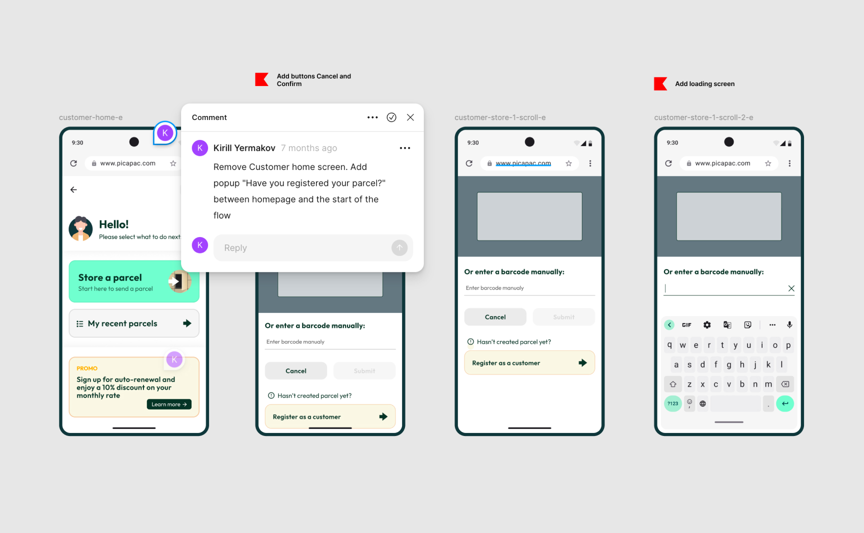
Usability study
The goal of the usability testing session was to test whether the key user flows were clear and intuitive, identify friction points in navigation and task completion, and validate that both customer and courier scenarios worked as expected in a realistic flow.
This study was conducted on real users - couriers from the Latvian post and few people as customers from Jetbeep and Picapac (those wasnt involved in app design process, so it was their first time that they saw the app). Before this UX study I created UX study scenario, wrote study prompts for each persona. Gathered insights from this study helped to improve user flows and app UX and UI overall.
Started with a research plan.
I formed research questions, set KPI’s, outlined methodology, found participants, and wrote study scripts.
Conducted a study and gathered data from it.
Unmoderated study, I wrote tasks, observed participants (I watched video recording sent by participant), and made notes.
Developed insights.
Insights gathered from these sessions helped improve user flows, clarify interactions, and refine the UX/UI before handoff to engineering.
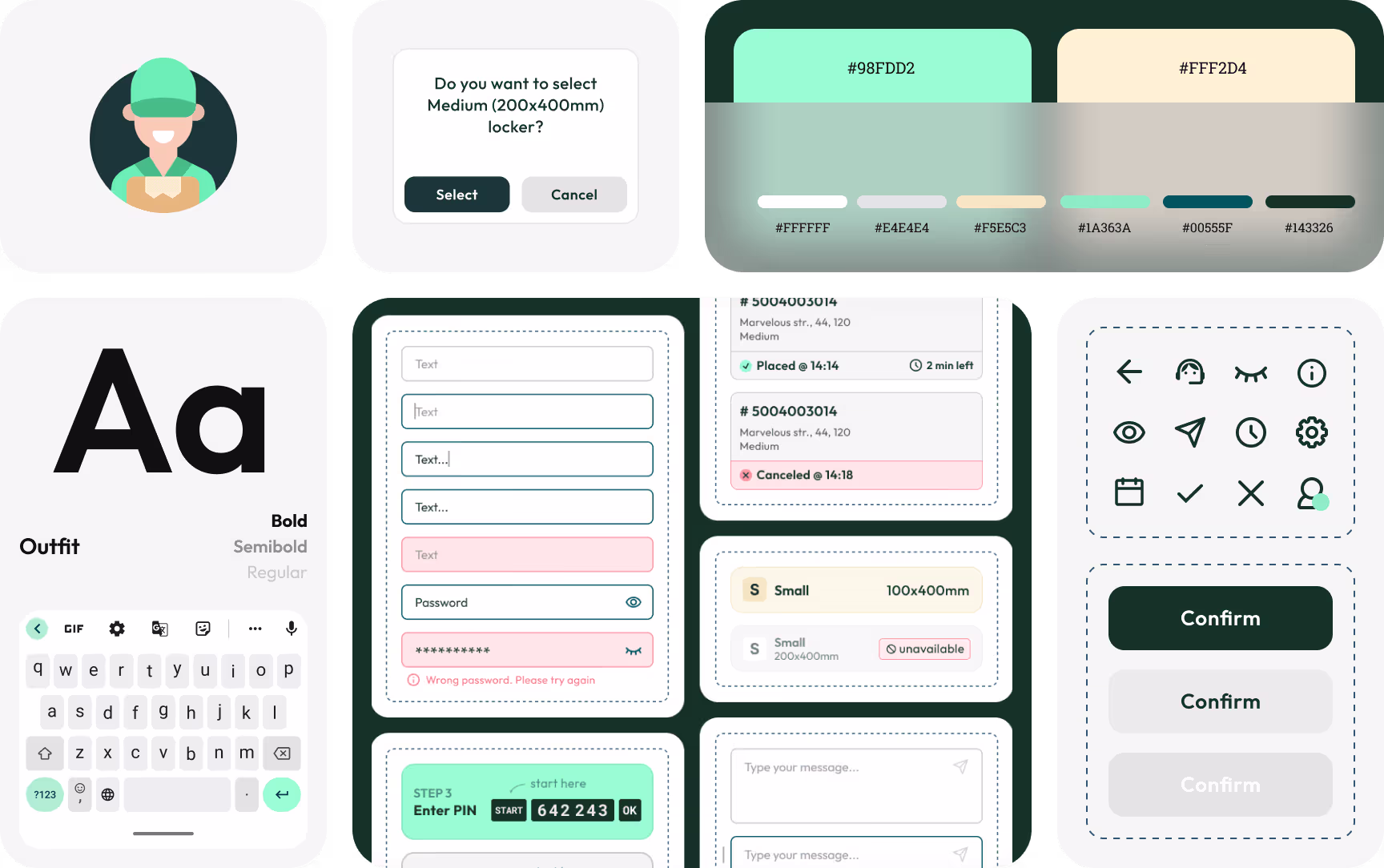
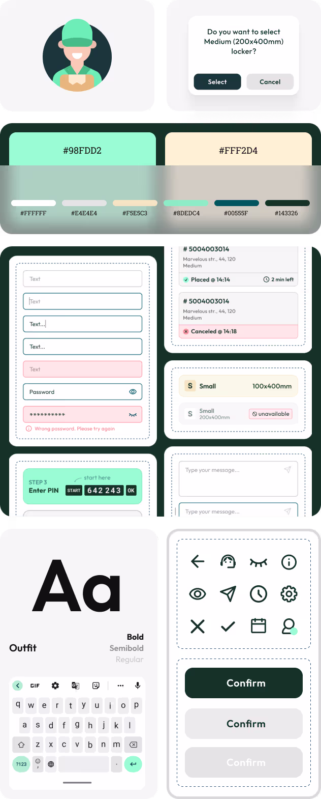
Scalable design system


.avif)